The film is a documentary about a local beekeeper, and I thought that to tide everyone over until I get the new rhino done I would show you the poster design I just finished up.

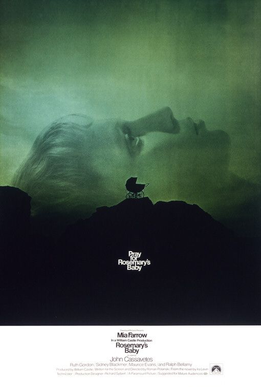
The smoker, the veil, the field, the smoke, the clouds, and the individual bees are all from seperate photos that I patched together. I like minimalist movie posters, especially the poster for Downhill Racer and for Rosemary's Baby, so that's what I decided to go for, and I thought that style would make it more clear that the movie is more than just a nature documentary.
I like the simplicity of the design, particulary the left to right flow of the smoke. I'd be curious to see more work on the title typography. Have you really picked the right font? Beekeeper is a difficult word with all those "E"s.
ReplyDeleteHey Kelly(and fam). Nice blog! What a talented family! The Beekeeper sounds very interesting.. I have to say, I didn't mind the type initially. I think no matter how you treat those "E"s, if you look at them too hard you will get stuck there visually... but that is because there's a lot of "E"s, not because of the type treatment... but then again, I haven't seen it in another font either. Good work over all.
ReplyDeleteFILMED PARTIALLY WITH A CARRIED BORROWED FROM T. MICHAEL MARTIN.
ReplyDelete